Task Analysis
The Task Analysis module provides a collection of analytical reports and visualizations that help organizations monitor operational performance, evaluate workflow efficiency, and gain insights into task and record management. These reports present key metrics related to data entry, response times, workflow status, business processes, records, and system activity, enabling administrators and managers to make informed decisions.
The module includes a variety of analysis views that allow you to examine different aspects of your organization’s operations. Each view focuses on a specific area of analysis and can be used independently to monitor performance, identify trends, and improve overall efficiency.
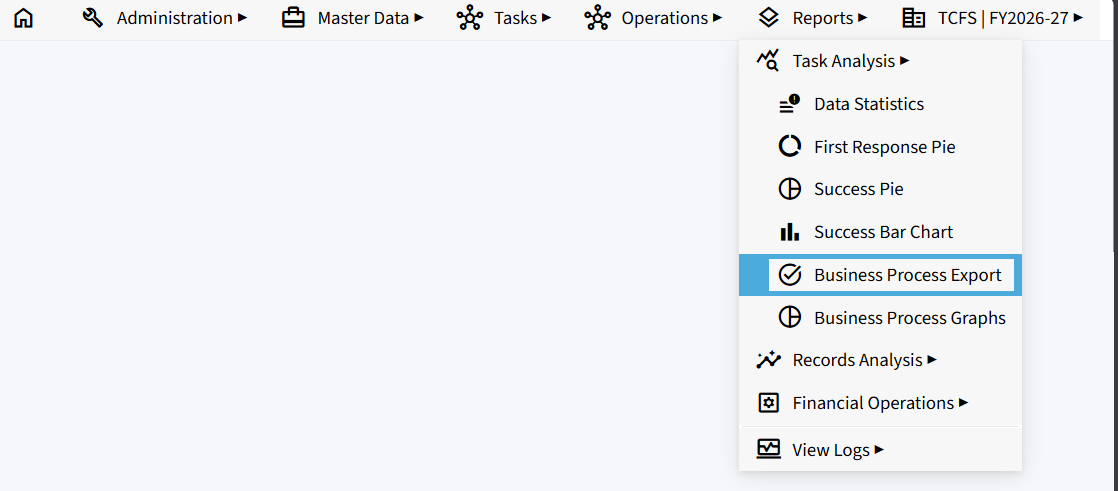
The Task Analysis module includes the following views:
- Data Statistics
- First Response Pie
- Success Pie
- Success Bar Chart
- Business Process Export
- Business Process Graphs
Here is a cleaner, more professional version suitable for an operations manual.
Data Statistics
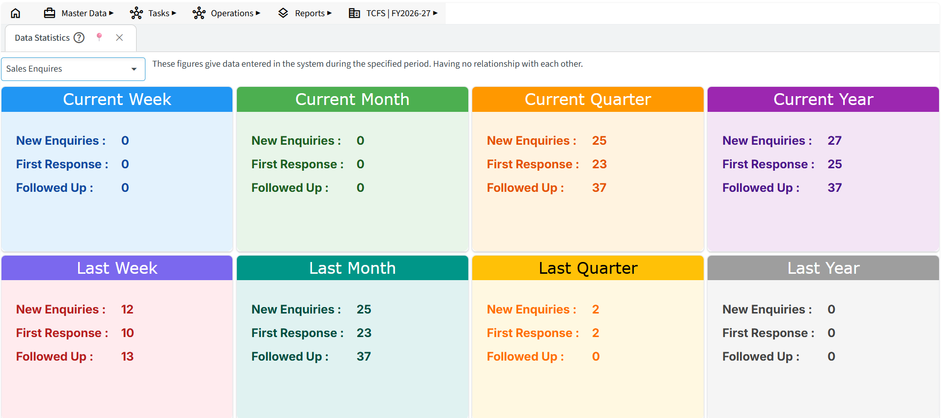
The Data Statistics section provides a summary of the number of records entered into the system during a selected time period. It is intended to help administrators monitor data entry activity and verify that users are actively using the application.
The figures displayed represent the total number of records created during the selected period. Each statistic is independent and should not be interpreted as being directly related to the others. For example, if a single enquiry has seven follow-ups, all seven follow-ups are counted separately in the statistics.
For detailed performance analysis and visual insights, refer to the pie charts available in the Dashboard.
Available Time Periods
Data can be viewed for the following periods:
- Current and Last Week
- Current and Last Month
- Current and Last Quarter
- Current and Last Year
This section is primarily intended to monitor user activity and system usage rather than evaluate business performance.
First Response Pie Chart
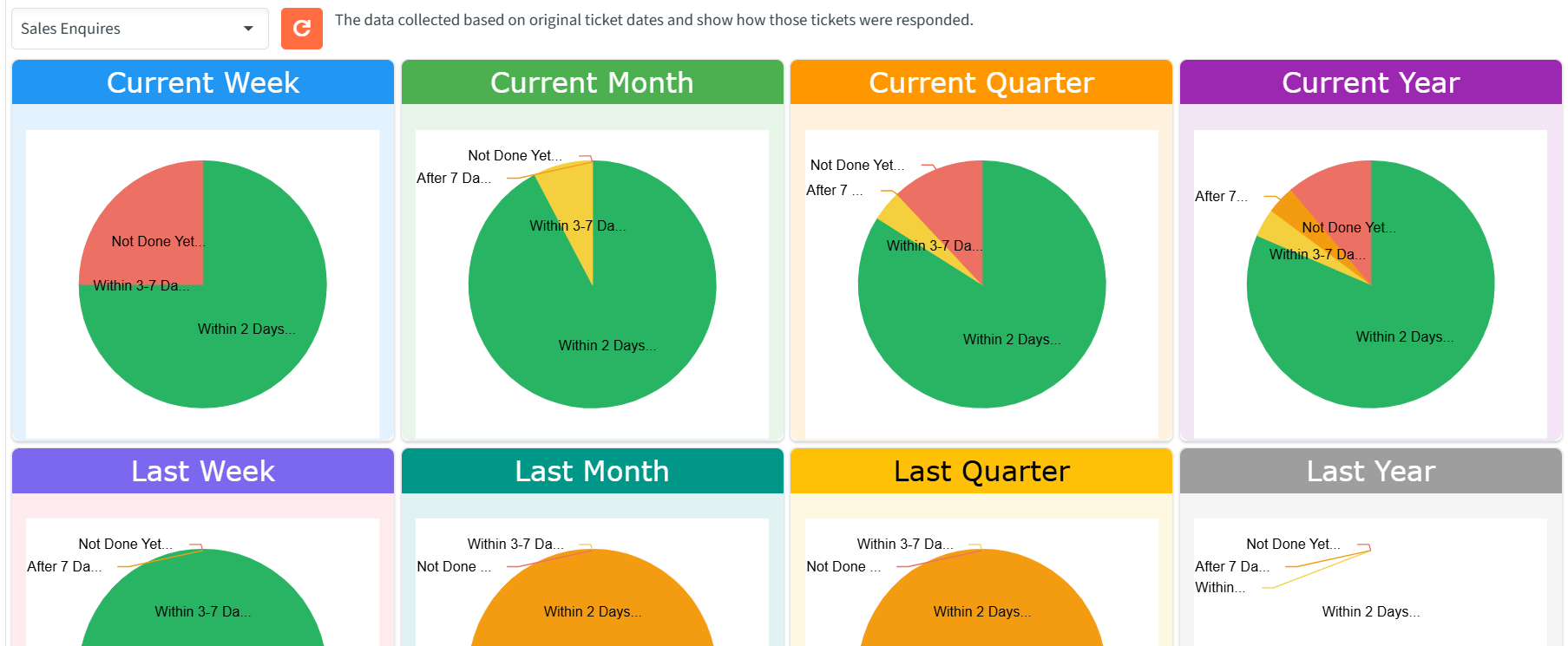
The First Response Pie Chart measures how quickly your organization responds to new customer enquiries or support tickets. Timely first responses are an important indicator of customer service efficiency and responsiveness.
The chart is generated based on the original ticket creation date and categorizes each ticket according to the time taken to provide the first response.
Response Categories
- Within 2 Days – The first response was provided within two days of ticket creation.
- Within 3–7 Days – The first response was provided between three and seven days.
- After 7 Days – The first response was provided after seven days.
- Not Done Yet – No response has been recorded.
Available Time Periods
The chart can be viewed for:
- Current and Last Week
- Current and Last Month
- Current and Last Quarter
- Current and Last Year
This report helps organizations evaluate their response times, identify delays, and improve customer support performance.
Tip: Click on the pie chart to view it in full-screen mode.
Success Pie Chart
The Success Pie Chart provides an overview of the current status of tickets or enquiries. It helps measure how effectively customer requests are being handled and whether they are successfully progressing through the workflow.
The chart is based on the original ticket creation date and reflects the current status of each ticket.
Status Categories
- Success and Closed – The ticket has been successfully resolved and closed.
- Success and Ongoing – The ticket has reached the defined success stage but is still in progress.
- Pending – The ticket is awaiting further action.
- Failed and Closed – The ticket was closed without reaching the defined success stage.
- Not Responded Yet – No action or response has been recorded.
Note: The workflow stage considered as Success is defined in the application’s workflow configuration. Refer to the Creating Workflow section for more information.
Available Time Periods
The chart can be viewed for:
- Current and Last Week
- Current and Last Month
- Current and Last Quarter
- Current and Last Year
This report helps administrators monitor resolution trends, identify bottlenecks in the workflow, and evaluate overall service performance.
Tip: Click on the pie chart to view it in full-screen mode.
Success Bar Chart
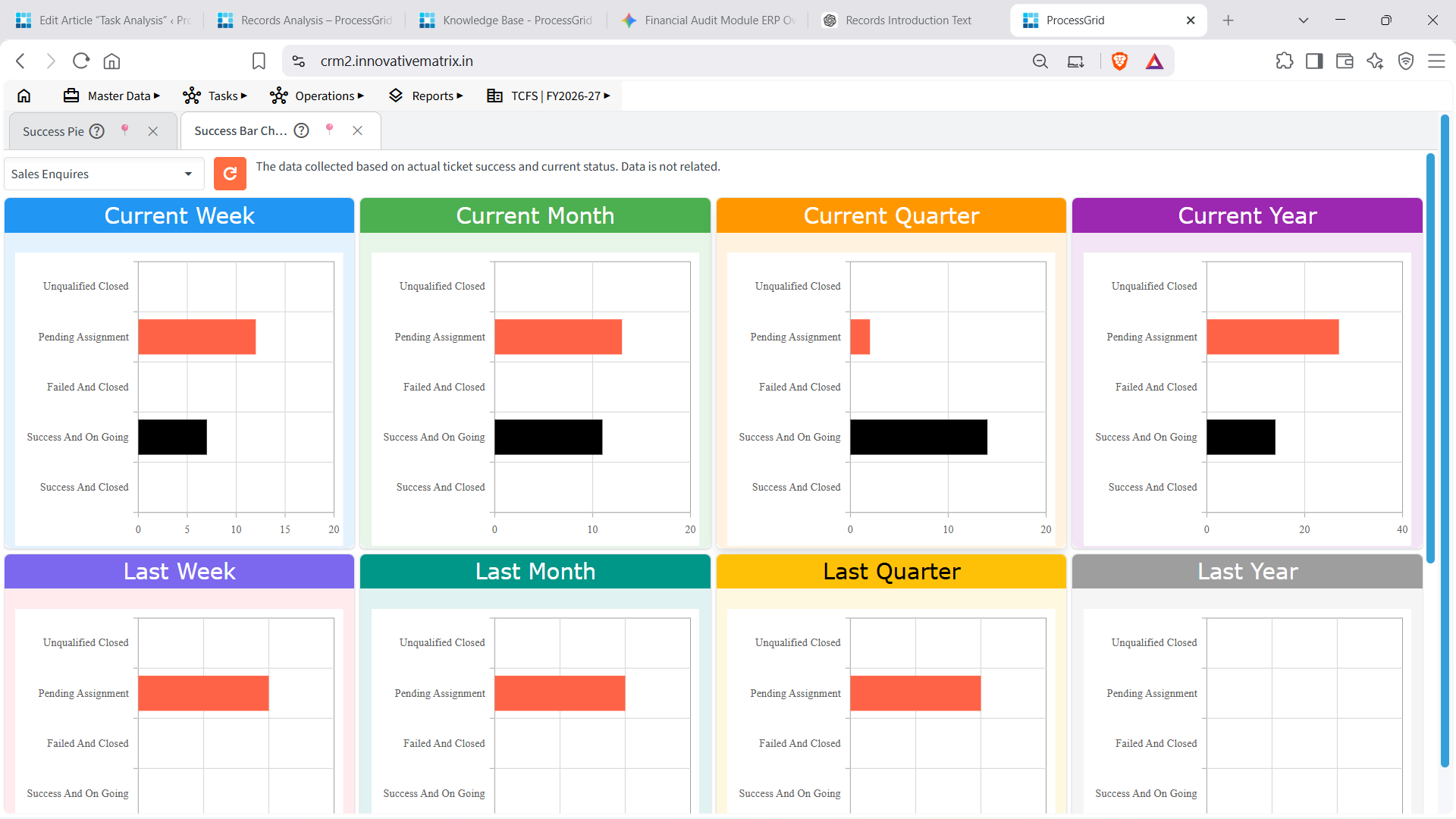
The Success Bar Chart presents the current status of tickets or enquiries in a bar chart format, making it easier to compare ticket outcomes across different time periods. Unlike the Success Pie Chart, the bar chart provides a clearer visual comparison of the number of tickets in each status category.
The chart is generated based on the original ticket creation date and displays the current status of all tickets within the selected business process.
Status Categories
- Success and Closed – Tickets that have been successfully completed and closed.
- Success and Ongoing – Tickets that have reached the defined success stage but are still in progress.
- Pending Assignment – Tickets that are waiting to be assigned to a user or team.
- Failed and Closed – Tickets that were closed without reaching the defined success stage.
- Unqualified Closed – Tickets that were closed because they did not meet the required qualification or business criteria.
Note: The workflow stage considered as Success is determined by the workflow configuration. Refer to the Creating Workflow section for more information.
Available Time Periods
The bar chart displays data for the following periods:
- Current Week
- Current Month
- Current Quarter
- Current Year
- Last Week
- Last Month
- Last Quarter
- Last Year
This view helps managers compare ticket performance across multiple time periods, identify trends, monitor workflow progress, and evaluate the overall effectiveness of the organization’s operations at a glance.
Business Process Export
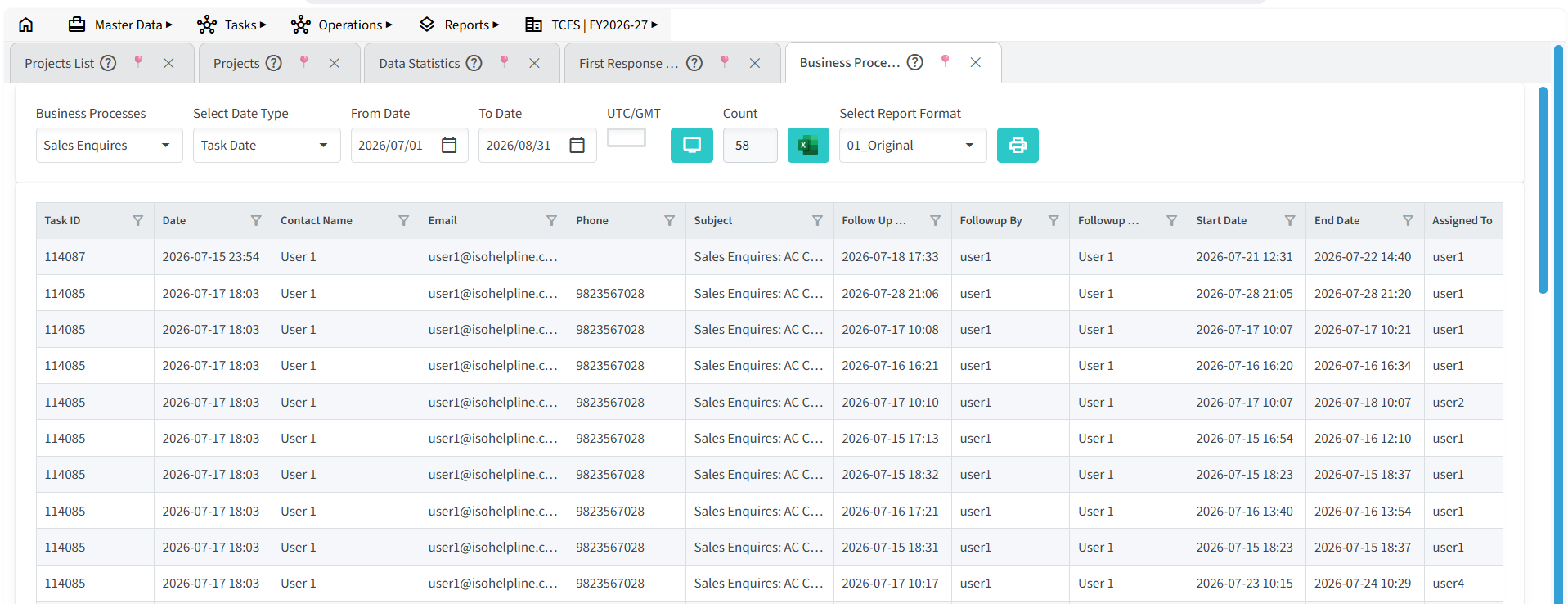
The Business Process Export feature allows you to generate and export detailed reports for a selected business process over a specified date range. It is useful for reviewing tasks, enquiries, projects, or other workflow-related records in a structured format that can be shared or analysed outside the application.
The report can be filtered using different criteria to ensure that only the required information is included. Once generated, the data can be exported in Excel format for reporting, auditing, or further analysis.
Report Filters
- Business Process
Select the business process for which you want to generate the report (e.g., Sales Enquiries, HVAC Projects, Customer Support). - Select Date Type
Choose the date field that should be used for filtering the records. Available options depend on the selected business process and may include:- Task Date
- Follow-up Date
- Follow-up Next Date
- Follow-up Next Date End
- Task Approval Date
- From Date / To Date
Specify the date range for which the report should be generated. - UTC/GMT
Select the appropriate time zone, if required, for accurate date and time reporting. - Report Format
Choose the report format that best suits your reporting requirements.
Business Process Graphs
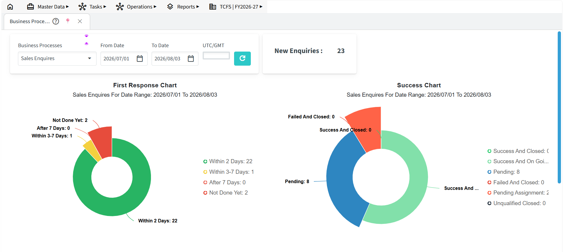
The Business Process Graphs feature provides a visual representation of key performance metrics for a selected business process. Instead of displaying raw data, it presents information through charts and graphs, making it easier to identify trends, monitor team performance, and evaluate workflow efficiency.
The displayed graphs are generated based on the selected business process and date range. The available charts may vary depending on the workflow configuration of the selected process.
Report Filters
- Business Process
Select the business process you want to analyse. - From Date / To Date
Define the period for which the graphical analysis should be generated. - UTC/GMT
Select the appropriate time zone if applicable.
Available Graphs
Depending on the selected business process, the page may display one or more of the following charts:
- New Enquiries – Displays the total number of enquiries or tasks created during the selected period.
- First Response Chart – Shows how quickly the first response was provided to newly created enquiries or tasks.
- Success Chart – Displays the current status of tasks, such as successful, pending, or failed.
- Analysis of Source of Information – Shows where enquiries originated, helping identify the most effective lead sources.
- Analysis of Reasons for Failure – Summarizes the common reasons why enquiries or tasks were unsuccessful, helping identify areas for improvement.
How to Access Charts and Graphs
- Navigate to the Reports tab.
- Select Task Analysis.
- Select the desired View from the dropdown.
- Select the Business Process.
- Refresh the report to view the generated graphs.